
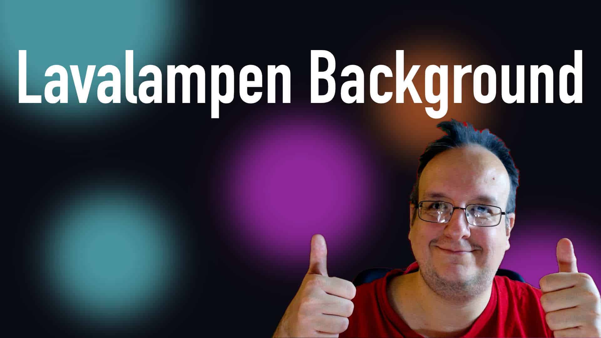
Wer wie ich schon ein wenig älter ist, der kennt die Lawalampen. Heute möchte ich euch zeigen wie ihr einen Lavalampen-Effekt als Hintergrund für eure Webseite programmieren könnt. Wie immer könnt ihr die Scripte auch noch selbst anpassen.
Video

HTML
<div class="container">
      <div class="klecks1"></div>
      <div class="klecks2"></div>
      <div class="klecks3"></div>
    </div>
CSS
:root {
        --bg-dark: #0a0a12;
        --neon-cyan: #00f5ff;
        --neon-magenta: #ff00ff;
        --neon-purple: #8b00ff;
        --neon-orange: #ff6b00;
      }

      * {
        margin: 0;
        padding: 0;
        box-sizing: border-box;
      }

      body {
        background: var(--bg-dark);
        min-height: 100vh;
        overflow: hidden;
      }

      /* Gradient Mesh Background - Lava Lamp Effect */
      .container {
        position: fixed;
        inset: 0;
        z-index: 0;
      }

      .container::before,
      .container::after,
      .container .klecks1,
      .container .klecks2,
      .container .klecks3 {
        content: "";
        position: absolute;
        border-radius: 50%;
        filter: blur(80px);
        opacity: 0.6;
      }

      .container::before {
        width: 600px;
        height: 600px;
        background: var(--neon-cyan);
        top: -200px;
        left: -100px;
        animation: blub1 8s ease-in-out infinite;
      }

      .container::after {
        width: 500px;
        height: 500px;
        background: var(--neon-magenta);
        bottom: -150px;
        right: -50px;
        animation: blub2 10s ease-in-out infinite;
      }

      .container .klecks1 {
        width: 400px;
        height: 400px;
        background: var(--neon-magenta);
        top: 40%;
        left: 50%;
        animation: blub3 12s ease-in-out infinite;
      }

      .container .klecks2 {
        width: 300px;
        height: 300px;
        background: var(--neon-orange);
        top: 20%;
        right: 20%;
        animation: blub4 9s ease-in-out infinite;
      }

      .container .klecks3 {
        width: 350px;
        height: 350px;
        background: var(--neon-cyan);
        bottom: 10%;
        left: 10%;
        animation: blub5 11s ease-in-out infinite;
      }

      @keyframes blub1 {
        0%,
        100% {
          transform: translate(0, 0);
        }
        50% {
          transform: translate(50px, 30px);
        }
      }

      @keyframes blub2 {
        0%,
        100% {
          transform: translate(0, 0);
        }
        50% {
          transform: translate(-40px, -20px);
        }
      }

      @keyframes blub3 {
        0%,
        100% {
          transform: translateX(-50%) scale(1);
        }
        50% {
          transform: translateX(-50%) scale(1.1);
        }
      }

      @keyframes blub4 {
        0%,
        100% {
          transform: translate(0, 0);
        }
        50% {
          transform: translate(-30px, 20px);
        }
      }

      @keyframes blub5 {
        0%,
        100% {
          transform: translate(0, 0);
        }
        50% {
          transform: translate(20px, -30px);
        }
      }






0 Kommentare